Homearama
This campaign project used a marketing strategy for Homearama that focused on increasing the number of ticket sales as well as ticket scans.
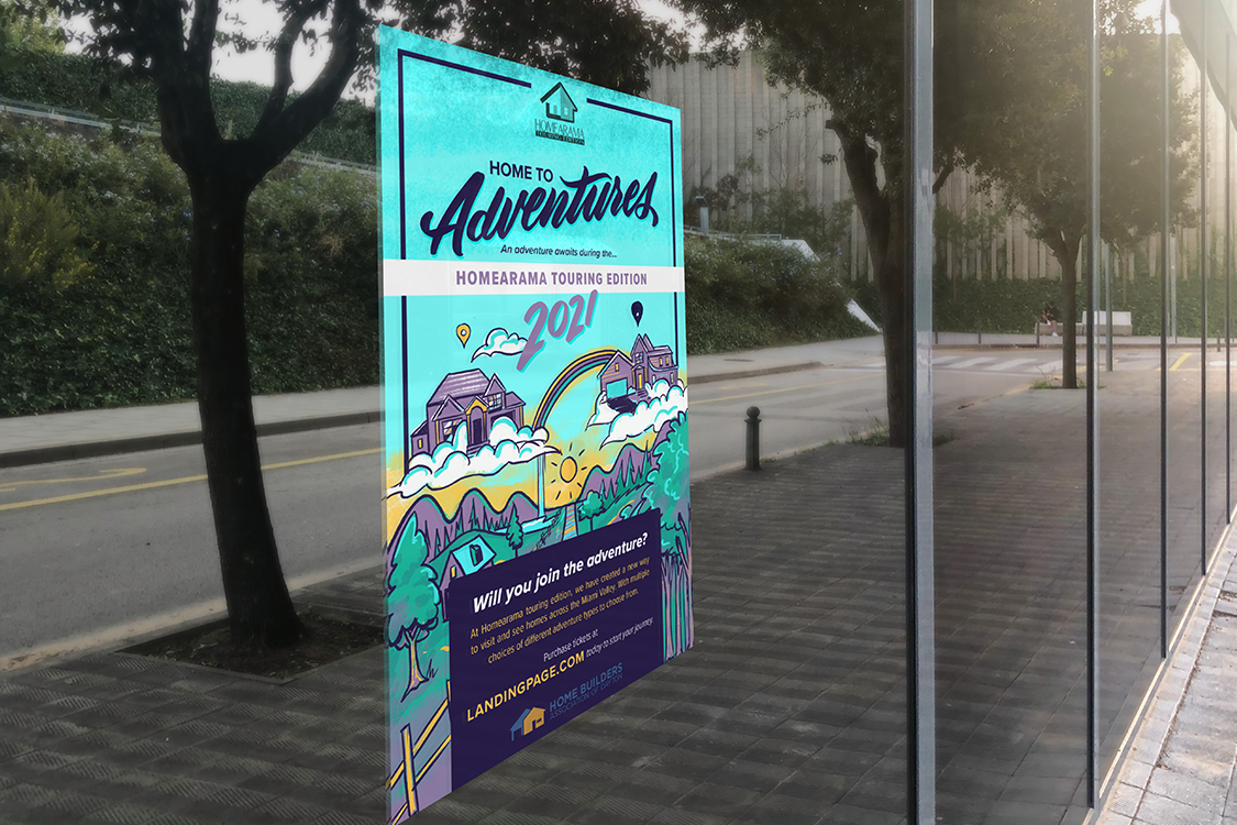
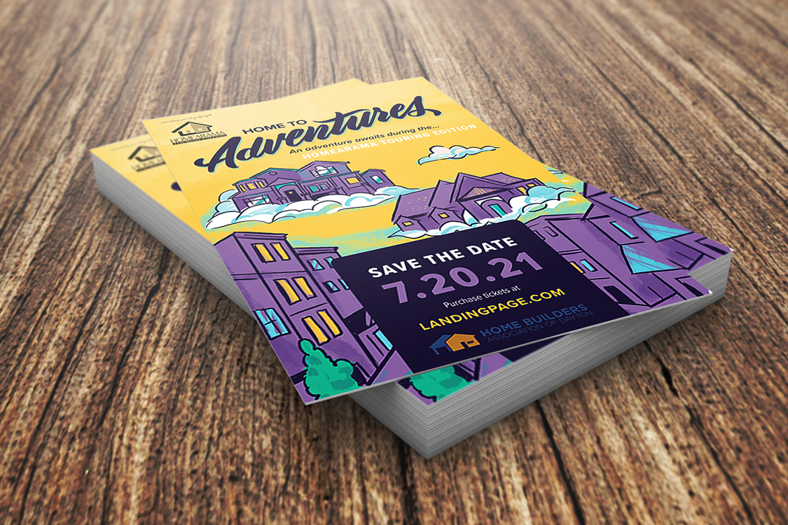
My team and I focused on posters and flyers that appeal to Homearama’s target audience. These posters and flyers will be in local businesses where this target audience is most likely to shop.
Typography
My main responsibility within my team was to determine what font would be best to appeal to the audience, as well as remaining readable. The font chosen was “Proxima Nova” and it is applied to way finding signage (as shown to the left), websites, posters, and fliers.
Posters & Fliers
Proxima Nova was chosen to be the main body copy on every form of advertisement for the Homearama event. Our team chose this style illustration to help evoke the feeling of adventure and a great way to spend your free time.


